How a fragmented 14–16-step operational workflow became a guided, mobile-first 6–9-step experience for Amtrak's internal teams and travelers.
Amtrak's internal operations and partner-facing teams relied on legacy B2C platforms built up incrementally over years, without a unifying design system or shared information architecture. Staff managing reservations, partner data, and operational records had to work across disconnected tools with inconsistent navigation and no cross-system validation.
This created two compounding costs: staff spent excessive time on routine tasks, and small data-entry errors propagated silently across systems because nothing was validated in real time. Support tickets related to interface confusion were a recurring, measurable drain on the operations team.
HypothesisThe core issue wasn't any single platform's UI — it was that three legacy systems had grown around three different trip types with no shared model between them. We hypothesized that consolidating them into one flexible flow, rather than improving each platform in isolation, would cut both the step count and the maintenance burden at the same time.
I was the sole design lead across three platforms, embedded directly with product and engineering. Given the fragmented starting point, a meaningful part of the role was alignment as much as design — reconciling different assumptions about what "done" looked like across teams that had historically owned three separate platforms.
Shadowed operations staff and partner-network users to map existing workflows step-by-step and identify where time and trust broke down.
Facilitated regular reviews with the product manager and ops SME to reconcile differing scope assumptions inherited from the three previously separate platform teams.
Consolidated overlapping navigation structures across the three platforms into a single, consistent model so patterns learned in one tool transferred to the others.
Built low- to high-fidelity flows starting from the smallest viewport — reflecting that most corridor travelers were booking or managing trips on mobile — then scaled up to tablet and desktop.
Ran structured in-person walkthroughs with each persona before development handoff, iterating on friction points in the guided-update flow in particular.
Before redesigning anything, I ran in-person research with real travelers and operations staff to ground the work in actual behavior rather than assumptions. Route data and interviews showed that roughly 70% of trips involved the East Coast corridor — overwhelmingly Washington, DC to New York and back — which became the primary journey we optimized around, while still supporting less frequent, more complex trip types.
Frequent DC–NY corridor rider. Books quickly, often on mobile, between meetings. Needs speed and certainty over exploration.
Uses multi-city rail passes to explore the country. Needs to compare routes and options, not just book a single fare — a fundamentally different flow from the corridor commuter.
Books vehicle + passenger travel together. Highest-complexity flow, with dependencies (vehicle size, drop-off logistics) the other two personas never encounter.
Testing three personas against one redesigned system — rather than designing three separate flows — was the central design challenge: the corridor commuter needed the fewest steps possible, while the tourist and Auto Train traveler needed more guidance and flexibility without the interface feeling bloated for the majority, faster-moving user.
The redesigned flow reduced a fragmented process that had grown to 14–16 steps depending on trip type, down to a consistent 6–9 guided steps — with the corridor traveler (70% of trips) landing at the low end of that range and more complex itineraries, like Auto Train, at the higher end. The flow was built mobile-first from the outset, then progressively enhanced for larger screens.
Structural diagram — not the literal interface, which remains under NDA.
The same underlying system serves all three trip-based personas — what changes is how much of it each traveler sees. On top of that, an accessibility profile (Blind, Deaf, Reduced Mobility, or Not Listed) is set once and layers into whichever flow the traveler is already using, rather than being a separate booking path.
This 3-step profile is set once and layers into any of the three booking flows above — it doesn't add steps to the trip search itself.
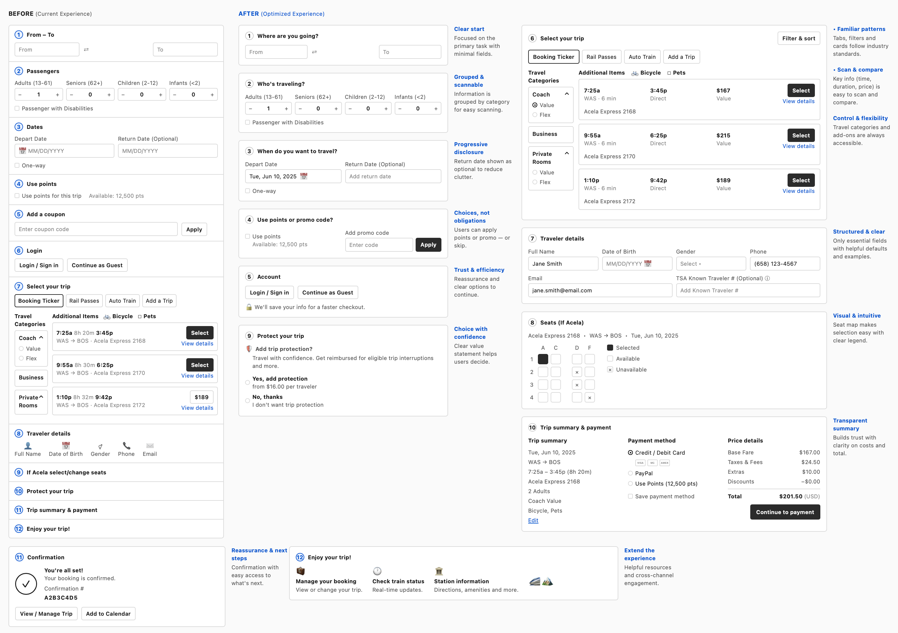
Why the step count differs by persona. The corridor commuter (70% of trips) rides the shortest path in the same system a tourist or Auto Train traveler uses — complexity is revealed only when a persona's trip actually requires it, rather than shown to everyone up front. Accessibility needs work the same way: set once, then carried into whichever of the three flows the traveler is already using.
Beyond the metrics, the redesign measurably reduced support tickets tied to interface confusion, and the mobile-first rebuild specifically improved completion rates for the ~70% of trips concentrated on the East Coast corridor — the highest-frequency, most time-sensitive user segment.
This project reinforced a principle I carry into every engagement since: for operational, high-stakes tools, the biggest UX win is rarely a new visual layer — it's collapsing the number of systems, steps, and decisions a person has to hold in their head at once.
Note: interface details are described narratively rather than shown as literal screens, in keeping with client confidentiality. Happy to walk through the underlying decisions live in conversation.
I'm open to Director-level UX & creative leadership roles, and select studio projects through AG Design Strategies.